Mivuni · Case study
Product in developmentA small product.
A world around it.
From a pet-wellbeing concept to a digital experience you can see, explore and make your own.
Explore Mivuni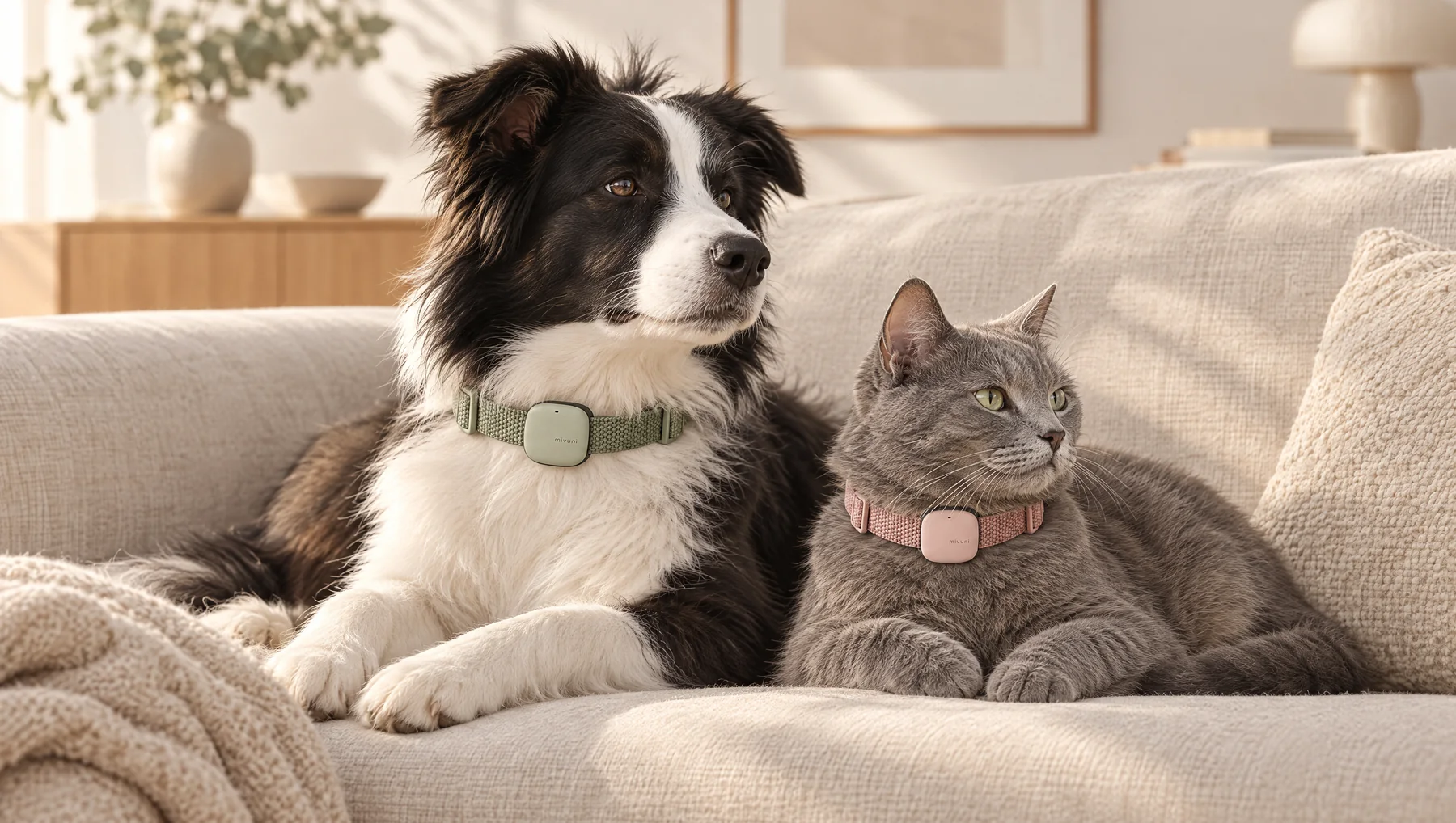
The project
Closer to their
everyday.
Mivuni starts with a familiar feeling: wanting to understand how your pet is doing, even when they cannot tell you.
The concept pairs a small wearable for dogs and cats with an app for rest, activity, owner-logged meals and changes in routine. Its focus is the individual animal and their usual patterns.
Our work gave that idea a visual world and a digital home. Brand direction, product visualisation, interface previews and web development came together in one experience, with an interactive configurator and a connected launch waitlist.
- Project
- Mivuni
- Sector
- Pet wellbeing
- Our role
- Brand, design & development
- Scope
- Website, 3D & launch waitlist
The challenge
Make it feel real.
Keep the story honest.
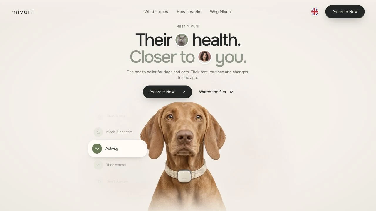
A physical product in development needs more than a list of planned features. People need to understand how it could fit into their lives, what it might look like on their pet and why they would return to the app.
The website also needed to make the stage of the project clear. Product renders and app screens show the intended experience; they do not imply that the hardware or its health capabilities have been validated.
The approach
One idea.
Three ways to connect.
A warmer product story
Soft ivory, muted colour and woven textures give the product a place in everyday life. The art direction connects the small collar module with the animals and people it is being designed for.
A product you can explore
A continuous 3D sequence carries the module through the page. Rotation, changing angles and an exploded concept view explain its form and intended components. Visitors can explore rather than rely on a single product photograph.
A clear next step
The colour configurator leads into a working launch waitlist. A visitor’s choice of pet, module and band is saved with their signup, connecting the experience on the page to a practical next step for the project.
The interface
Their day,
at a glance.
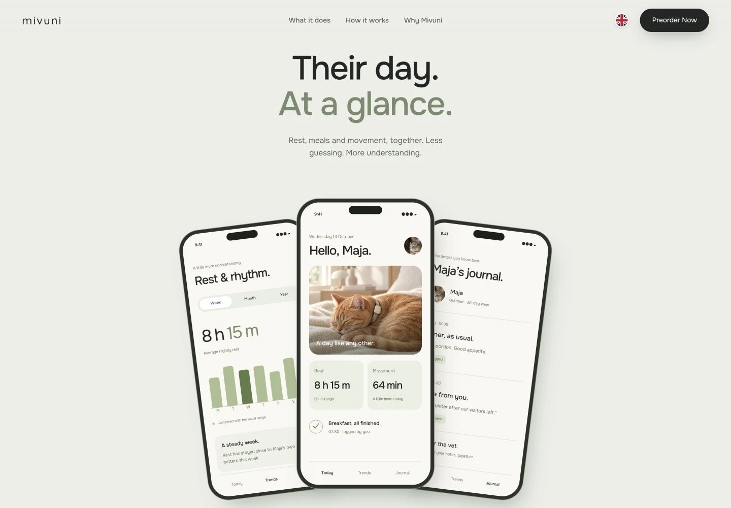
The app previews bring the product’s purpose into focus. A daily overview, a view of rest patterns and a journal show how observations could sit alongside the owner’s own notes.
Instead of presenting isolated numbers, the interface puts them in context: a typical week, a meal logged, a change worth watching. These are illustrative interface concepts with example data, designed to explain the planned experience.
The interaction
Make it
theirs.
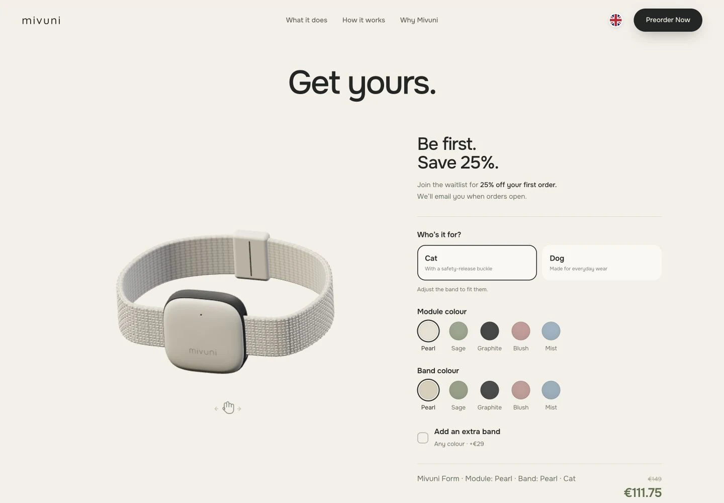
Five module colours and interchangeable woven bands make personalisation part of the story. The live 3D preview responds to the visitor’s choices and can be rotated to explore the form.
That interaction continues into the signup. The waitlist stores the selected combination with the visitor’s details, without taking payment. The site also adapts its presentation for smaller screens and reduced motion, with still-image fallbacks for its 3D scenes.
Project status
A first audience.
A foundation to build on.
The result is a live website that makes the concept explorable, presents the planned app experience and collects launch interest with product preferences attached.
Mivuni remains in development. Hardware testing and validation are still ahead; the product imagery and interfaces document the concept at this stage. The delivered outcome is the digital experience and signup infrastructure.
